Cathay Pacific is one of the better airlines out there, and they know it as much as the world does. Airlines are a customer facing business as much as they are a behind-the-scene show, and airlines continuously work to catch eyeballs, which they would like to convert into butts in seats going forward.
Cathay Pacific has just started to roll out their brand refresh, which is something they are doing after a gap of 20 years. As a part of this roll out plan, the first instance will be the refreshed brand identity, which will be rolled out over the next few days across the network, and will last into the next 18 months.
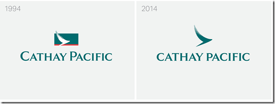
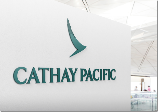
First step, the logo, addressed as The Brushwing is changing. Here is the new logo and the comparison with the old one.
Amongst the next steps will be a new website, which will perhaps move to selling a lot of products and services such as cars and hotels as well.
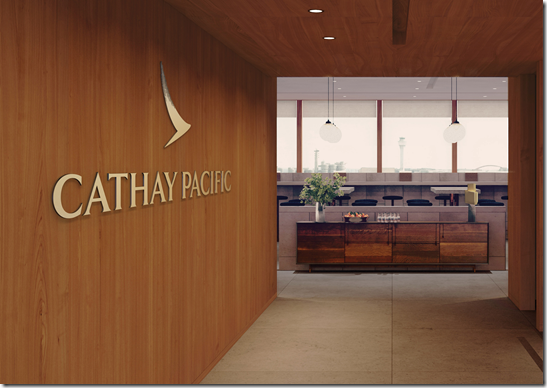
New lounges will begin to open from December, starting with Haneda in Japan and new company-wide signage will start appearing from the second half of 2015 onwards.
There are more changes coming, but these are the first of them the company has announced. I for sure love the new logo and signage. Do you like it?
Join over 3600 people who check-in daily to find out about the best in travel.
Free emails (once-a-day) | RSS Feeds | Facebook Updates | Twitter | Instagram


The subtle changes reflect well with the overall brand positioning of Cathay. Sophistication well defined.
crap !!!
Maybe they’ll also add a gaudy, stylized tail on their planes that provides no balance with the rest of their re-branding…Oh wait, we’ve seen that already elsewhere!
I think they did an amazing job of keeping it familiar but yet much more fresh and light feeling. The old one feel like a 90’s relic, very weighted and too fussy. I like how the brush/bird/wing is the focal point and it looks like the design lends itself to be more flexible in many different types of applications.
It looks like a boomerang.
i like it, but it’s so similar to the old one that i don’t see the point of paying an expensive rebranding exercise for basically nothing